WordPress Themes for Podcasting: A Guide to Choosing & Using
WordPress has been a quick and easy website solution for decades. A good wordpress theme for podcasting will offer up all the tools you need to make the best possible website. This way, you can spend more time on your podcast content.
Some WordPress themes are better than others for podcasting. Some themes are free, others cost money. The vast selection of WordPress themes available can be overwhelming. But, narrowing the choices down isn’t too hard.
So, to give you a head-start, here’s what I’ll help you with in this article:
- Sort out your thoughts about what you want in a theme
- Use web design best practices
- Convert web users into listeners
And remember, if you haven’t signed up for hosting, or set up WordPress yet, start here:
How to Build a Podcast Website
You can come back to find the perfect wordpress theme for podcasting later!
What are podcast web design best practices?
Podcast sites need to let the user listen and subscribe, right away. You also want an immediate spot where your listener can hear your podcast. In general, you need direct navigation and clear design.
Direct Navigation
You want as few steps as possible to the most important information. Eyes move faster than fingers and loading time. Too much scrolling, too many clicks, or slow loading, all can make a user lose interest.
WordPress arrived before podcasts were a big deal. Originally, it was designed for blogging. The expectation was that readers viewed posts in order by time. For podcasts, however, you need regions divided by topic and medium. This way, the user can find posts that are just for listening, and posts that are for view. If they need a media kit, creative team, or sponsorship information, they don’t have to scroll by date.
Think of the home page as a game board, the center of your web site, rather than the beginning of a line. Think of each category as a game piece on that board. Each piece has different superpowers.
Centralized home page layout
For example, take a look at the home page for the Hostile Worlds site.
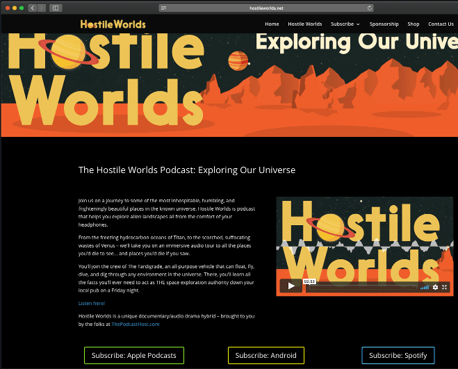
You can scroll down, to read episode posts in order by date. Or, you can look across the static bar up top, to find paths to specific information. In the center of this first page, the user can read a description of the show. They can click on the player to listen immediately. Below are links for the user to subscribe right away.
Clear Design
Accessibility is key to making sure that any listener can get to your podcast. Fonts, colors, and alt-text aren’t just arty choices, they’re path builders. We’ll go over this in more detail.
Your web site has to be clear on any device. It should be as good on the computer where you design it, as it is on a mobile device where people listen. WordPress’ themes, in general, are good at transitioning between phone, tablet and desktop layouts. You’ll want to test out your web site on different screens.
How do we find a WordPress Podcast theme that sticks to best practices, and fits you just right?
First, think about your site as a whole. Remember the game board analogy? Each of those game pieces has a lot of power.
Let’s go to the map.
Draw a circle and write “Home” in it. Draw arms reaching out from it (not too many, between 5 and 7, we’ll explain why). Each of these arms is a category.
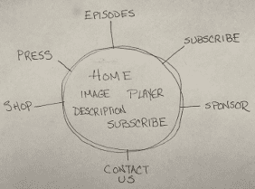
These categories are the types of information most important to your relationship with your podcast listeners. WordPress calls these Parent categories. You want no more than seven.
According to a psychology paper published by George Miller at Harvard in 1956, five to seven of any group is as much as human short-term memory likes to use at any given time. This has become a marketing rule of thumb worldwide.
While you sketch this out, you may be tempted to have sub-categories of each (giving your arms hands and fingers). Don’t do this unless you absolutely have to. The less complicated your map is, the easier it will be for you to build on it.
What do these categories do?
Remember the static bar of categories at the top of the Hostile Worlds page? It’s more important than you think. Let’s say someone wanted to sponsor Hostile Worlds, so they searched for it on Google. Here’s what would come up in search results:
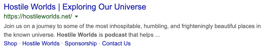
If that potential sponsor has already heard the podcast three or four times, they don’t need the main page. Why slow them down? They can click on Sponsorship from the search results, because you included it as a category. Boom.
If you put your Sponsorship information as a sub-category, under Contact Us, it won’t come up in search engine results. Search engines don’t crawl through drop-down menus.
Accessibility is essential to getting listeners.
You want anyone who’s interested to be able to get more information about your podcast. Don’t leave out people with different abilities.
These tips go a long way toward spreading your podcast’s reach:
- Sans-serif fonts are easier to read on a screen, and serif fonts easier to read in print. Think about the text in the 80s era Apple logo, vs. the text in the Facebook logo.
- High contrast colors help people with vision issues. Black text on a white background (or vice versa) is easier to read than, say, pink text on a blue background.
- Consider colorblindness when creating your branding. Imagine your website in grayscale: would it be clear to the user?
- Try using colors in conjunction with symbols and patterns.
- Here’s an oversimplification, worth considering. Avoid combining green with most colors other than white, and avoid combining blue with purple or gray.
- Alt-text, or descriptions for links and images, are extra typing, but use them whenever possible. Screen readers use this data for the visually impaired. Use capitalization and punctuation where appropriate, so the screen reader can read it correctly.
- Transcripts of your episodes always help! People who have auditory processing issues want to experience your work, too. Podcast reviewers love them, so they can examine your show more deeply while writing about it.
- Detailed information about accessible website design is available at usability.gov.
Podcraft has an episode where we discuss accessibility in podcasting in greater detail. Clear the path so your ideal listener can get through!
Ease of loading
While you’re thinking about efficiency, remember that WordPress loves plug-ins. They can be a good way to make your page unique. But, they can also slow down your web site’s loading time. Use them sparingly, if at all. Images, too, can slow a page down, so make sure that your image is at 72 dpi, not print quality.
The easiest way to find WordPress themes for your podcast
Go to WordPress.com and select your site’s dashboard or administrative page. Look at the left hand menu. Select Customize, then Themes. This will take you to the WordPress Themes Gallery. There will be hundreds of themes available.
The search box asks if you’re making a web site for a business, wedding, etc. If you typed “podcast” here, WordPress will show you themes that are good for art and business. That’s not bad. You want something more specific, though.
Take a look at the Search box, to narrow things down. Below the search box, click on “Feature,” then select “Accessibility Ready” and “Post Formats” (you’ll need to click “Show all” on the right). Or, you can type this into the search box: feature:accessibility-ready feature:post-formats.
Click “Free,” on the right of that search box. WordPress will show you theme options that
- are accessible
- will let you add an audio link in a player
- are standard-issue with a WordPress account.
Compare them to your sketched-out map. What theme is right for you?
Podcast Specifics
Again, you want audio embedded into your home page, so users can listen by just clicking “play.” There are a couple of ways to make this happen. You also want consistent branding in your images, so that everyone knows it’s you, and not some other podcast with the same name and description.
Support for Post Formats
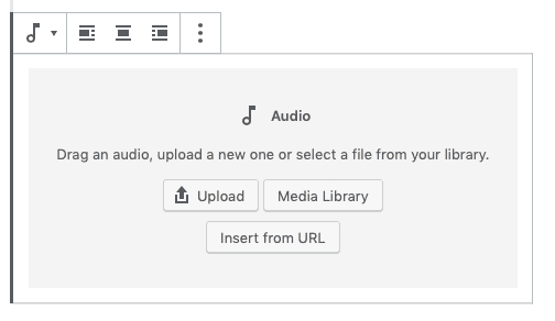
This lets you have embedded audio in a post. When you choose the paragraph where you want the audio to appear, you can either type /audio, or, click the music-note symbol. Then, you can enter your podcast hosting service’s url for the specific episode you want. The basic embedded audio feature doesn’t include your episode’s art or show notes. You can always add a text caption, though.
Third Party Player Support
Check and make sure that your theme supports plug-ins. Then you can add something like Hani Mourra’s Simple Podcast Press, or Pat Flynn’s Smart Podcast Player. These particular plug-ins include your episode artwork and show notes. If you use Libsyn or Blubrry, they have plugins for all WordPress themes. You can read more about that in our comparison of Libsyn and Blubrry.
Visual Art and Branding
WordPress themes give you lots of options when it comes to visual art. Be sure to keep your branding consistent. Make sure that your colors match or complement your podcast art. The art in your theme header should match or be evocative of your podcast art. If you need good podcast art quickly, you might want to try The Podcast Host’s art service.
Before you launch, when you’re still selecting a WordPress theme, make a couple of test posts to see how they look (publish them only to private). Look at them not only on your desktop, but also on mobile devices. WordPress wants their themes to look good on any screen, but, as always, your experience may vary. Some themes adjust the size of your images and text formatting, some don’t.
3 Free WordPress themes for Podcasting
- Affinity (created by Automattic) is intended for wedding planning. But, it has everything you need for a podcast. The layout has a 2-column widget to minimize scrolling.
- Twenty Seventeen (by The WordPress team) has not just a custom header image, but a custom header video. This is flashy, and there’s a fine line between eye-catching and distracting. Its previous versions (2016, 2015, 2014, 2013) are also good for podcasting. They include menus of social media links so you can keep all the avenues of engagement in one place.
- Franklin (by Michael Burrows) has a two-column layout option, and maintains integrity of images and text between mobile devices and desktop. It has all the good features of the previously mentioned themes, with the clean look of a print newspaper.
Paid WordPress themes to add polish & features
If you want to stand out from the crowd, you could go the paid route. Paying just a little for your theme has a lot of benefits, such as:
- The quality of design and features jump significantly from free to paid
- Free support if you need help in installing or changing the theme
- Longevity – paid themes will generally be updated regularly and long-term, whereas free themes can become abandoned
One paid option is Second Line Themes. They make beautiful WordPress themes especially for podcasting.
You can read Colin’s review of the Second Line Themes range here, and see a few examples. Gumbo and Dixie have excellent players, and Tusant allows you to have a good Subscribe button.
The second option is Divi, from Elegant Themes. Divi isn’t specifically for podcasting, but is excellent for that purpose nonetheless. Divi has so many options and variations that you can make a great looking website for just about any purpose, and then simply embed your podcast player when needed.
If you want more detail on how to install these themes, once you buy them, check out the Design section of our podcast websites guide.
You can always have a do-over
WordPress Themes are easily swappable. Your information will stay the same, even if you change the layout. Podcasters often update their websites over time, anyway.
Knowing what the best WordPress theme for podcasting is, means knowing your podcast. Once you’ve sketched out a map of what you need, you can narrow down the wide variety of options. By using best practices for minimalism and accessibility, you can convert users into listeners easily. You can get the audio embedded and the subscribe button right in the first landing page.
Do you have a favorite WordPress theme? Let us know in the comments. Tell us what makes it special.
And, if you need more help choosing a theme for your Podcast, join us in Podcraft Academy where you can discuss WordPress themes in live Q&As and in the community forums!