Brand Building Blocks: Your Podcast Colour Palette
It’s colour time! Colour time is one of my favourite times when it comes to branding. It would probably be graphic design if I had any talent in it — but alas, I do not. Your colours are the building blocks of your brand. They’re the foundation that you grow all the rest of your branding from. Honestly, you don’t need any other part of a brand set up to start building a colour palette, but you need your colour picked out to do everything else.
Honestly, even if your show is already running but you’ve never built one before, I would highly encourage you to do so. You can use the colours from what you already have going on to inform the rest. This way the future of your branding doesn’t look like the website my mother tried to build last year — this failed project doesn’t exist anymore, but at its height, there was a picture of a bird, pink and blue titles, and green text. Yikes!
What is a Colour Palette?
A colour palette is exactly what it sounds like – a group of colours put together for the purpose of using them as a collective.
Colour palettes are used by everyone from UI designers to painters. Planning them in advance is important, otherwise, you might end up with a clashing colour that brings the rest down.
When you’re building a podcast, you’re building a brand. To make that brand work together you need a set of colours that give off the perception and look you want them to.
Understanding Colour
Before we get into the how let’s talk about colour in general.
It might surprise you to know that colour carries weight and meaning, beyond the “what’s your favourite colour” question. Just like smell, taste, sound, and touch can evoke emotions, so too can colour. For example:
Red is the colour of anger and fury, but it also implies excitement and adventure. If a politician is wearing a red tie, you might be sceptical about them but swiping on some red lipstick and stepping into a pair of red pumps before a date might give you a rush of confidence.
Yellow, the colour of the shining sun symbolizes optimism, happiness and brings on an overall sense of playfulness. But we also paint our taxis, road lines and signs with it as a cautionary symbol.
Black gives things an air of sophistication, even elegance. But we also use it to symbolize darkness and dread – especially paired with varying greys and deep reds. Chances are your favourite true crime show is shrouded in it.
Pink is the traditional colour of feminism, symbolizing romance and sensuality. The closer you tend to get to red with this colour, the sexier it tends to be.
Blue, a wildly popular colour for logos, represents trustworthiness and reliability. Which makes it no surprise that many new startups and companies in the financial area tend to go with a variation of blue.
These are only the tip of the iceberg of colour theory, and by no means is an inclusive list. Incredible Art has one of the most easy-to-understand and entry-level posts on colour meaning and variations across cultures.
How to Build Your Own Colour Palette
You don’t have to be a creative genius or an experienced brand designer to build your own colour palette. In fact, pretty much everyone out there can do it – colour expertise or not.
There are limitless possibilities when it comes to finding the perfect colour palette. But for beginner branders, I recommend using one of these three wildly easy methods:
1. Poke Through Trending Palettes
No experience or ideas for brand palettes, no problem!
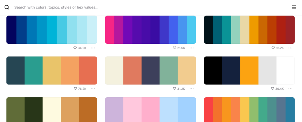
Coolors – which is completely free – has an entire explore section dedicated to providing you with trending palettes for inspiration.

You can go there, pick one and use it as is. Or you can start with a premade one and modify it until you come up with the perfect combination for your brand. If you’re not familiar with hex codes for colours, they’re the codes that graphic designers use to ensure colour remains consistent, every time it’s used.
2. Pull Colors From an Inspiring Image
I don’t know about you, but a lot of my branding inspiration comes from images. I once spent an entire afternoon manually picking through old monster movie posters to generate the perfect palette.
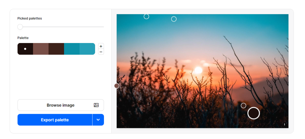
Thankfully, you don’t have to do this. Both Coolors and Canva have image colour picker tools that allow you to upload an image of your choice and extract colour codes.

You can then use this combination as your palette, or you can modify it and create something uniquely tailored to your brand’s personality.
3. Play With Your Favorite Colors
This is by far the most time-consuming method of the three, so I recommend it as a last-resort type deal. But if you can’t find anywhere else to get inspiration, then simply start throwing the figurative colour spaghetti at the wall and see what you can come up with.
What Does a Finished Palette Look Like?
When you look at a company’s marketing materials, chances are you can really only identify one or two colours from their brand palette. Every brand has two or three primary or main colours, which represent the majority of the materials you’ll see.
Like the rest of branding, there’s not really a right or wrong way to create a colour palette. Save for the fact that you shouldn’t steal the exact palette from another brand, the colour world really is your oyster.
Let’s take a look at a couple of finished palettes:
Example #1

While there are eight colours in this palette, it’s pretty clear that the focus is on orange and yellow, with a couple of cool colours to provide a complimentary accent.
Since I own the brand that this palette belongs to, I can tell you that the main colour is “Safety Orange” (#F66B18) with the primary accent colour as “Cyber Yellow” (#FFCD00).
“Light Green” (#8FE388) is used when something needs to stand out, and “Gunmetal” (#213037) serves as accenting text, while “Smokey Black” (#1C1515) – which was simply created by shading down its lighter counterpart – serves as the base text.
I know this looks like a big colour palette to work with. But to the audience, the finished brand material really only contains orange, yellow, and the occasional splash of green. But the expanded palette allows for a tad bit more customization when I need something to fit just that much more smoothly.
Example #2

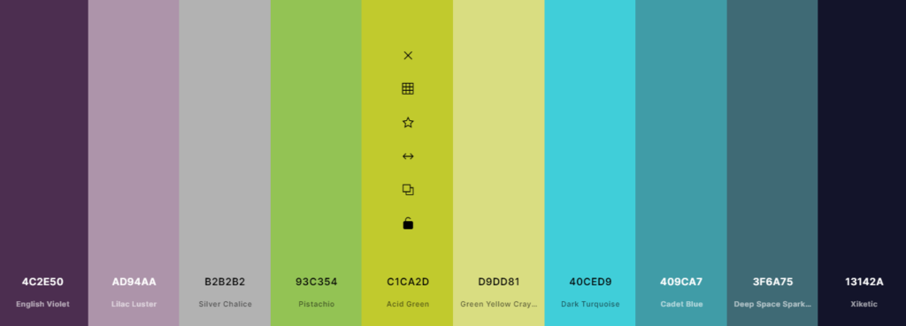
This second colour palette is also owned by yours truly, and it is specifically designed for a podcast. It contains a whopping 10 colours, but the majority of them aren’t featured often.
Unlike “Gunmetal” and “Smokey Black” from the last palette, none of these colours were made by shading up or down their counterparts. Instead, they were almost all made by combining the two adjacent colours to create a smooth transition from one side of the palette to the other. The two tiny exceptions to this are “Acid Green” and “Turquoise” which were both given an almost neon finish to make them pop a little bit more.
The main colours used from this palette are English Violet and Acid Green.
Green Yellow Crayon serves primarily as a website accent, and the bulk of the text is made up of Xiketic. The remaining colours are used as accents were required but don’t play a starring role.
I will disclose that there is one additional colour that shows up in the podcast branding but isn’t featured on the palette. That is a pale, glowing yellow. While it does play an important role in the podcast cover art, it wasn’t included on the palette because we didn’t want it in any subsequent marketing material.
Tips for Building a Color Palette
Building a colour palette for your podcast brand doesn’t have to be a hair-pulling activity. However, there are a few things to keep in mind while you’re creating:
Choose Your Dark Carefully
Your colour palette should include one very dark colour. While most people will look at the colour and think it’s black, I highly recommend taking your next dark colour and simply shading it down to an almost black.
True black (Hex #000000) as you see it on screens and in print materials is actually quite vibrant, so it might not fit perfectly with the rest of your colours. However, if you’re using a darkened version of another palette colour it should fit in smoothly.
Use Default White
Just like you need an almost black, you also need to be able to use a variation of white. This can be any cream, eggshell, or white variation that allows you to create a proper light-to-dark contrast.
However, you’ll notice I didn’t include any whites in the examples provided. That’s because I always use the default true white. Due to its default nature, it doesn’t really need to be defined by a colour code to be used correctly (though it’s Hex #FFFFFF if you’re not familiar).
While there are some beautiful white variations out there, any colour that isn’t a base true white will need to be added. Unless you have a specific reason to use an off-white in your branding, I highly recommend sticking with the basics.
Think Costs
This advice is only applicable to those that want to offer physical branded products (like podcast merch), but some colours are really expensive to print.
Once upon a time, I worked for a brand that used gold as their main colour. It was an absolute nightmare. While the final product was nice, the cost of printing the gold made printing branded products really expensive to have made.
There are a few reasons for this, but the primary one is that gold requires a metallic component which seriously raises the price. Brands that use silver or even rose gold could also run into this issue.
It’s also worth noting that if you’re creating physical podcast merch that requires a black background (such as your logo on a black t-shirt) you’re also looking at higher costs.
Remember, Not All Colors Appear the Same
From screen-to-screen and product-to-product, colours don’t always appear the same.
There’s a massive difference in the appearance of colour between my Apple and HP computers – some to the point of being unrecognizable. Similarly, colours appear differently on my Samsung S10 than my iPhone 12 Max – though the differences aren’t usually as drastic.
The same goes for how your colours appear on a screen versus being printed on a shirt. This shouldn’t necessarily influence the colours you pick, but it is helpful to choose identifiable different colours. For example, the #F7783A and #F66B18 in my first example are close enough that they might look the same on some devices.
Branding Your Podcast
Branding is an important part of creating a podcast. Without pre-determined branding, it’s easy for marketing to become overwhelming.
If you want to make your podcast production as easy as possible, make as much material ahead of time as you can. Don’t stop at your logo and cover, but set up pre-designed social media templates and other assets. This way you can drag-and-drop later on.
It’s important to get on top of your marketing right off the bat. With a little planning, promotion can be pretty easy. Need some marketing guidance? The Podcast Host Academy has a great course on growing your show that’s really helpful.

